Exat — New typeface by Hot Type
About font
Inspired by EXAT 51’s artistic and architectural endeavors, this typeface
features clean lines and structural clarity. The Exat typeface captures the
very essence of modernist ideas, striking a harmonious balance between form
and function.
It undeniably references one of the most popular typefaces of all time, all while
incorporating extraordinary width and weight options in a robust character set. Exat
is inarguably our most ambitious release yet, offering the user total control in
choosing the right type—fit for any situation.
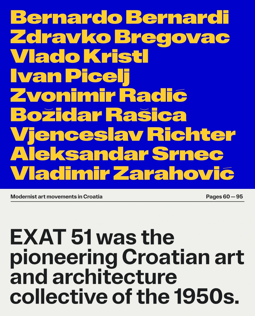
Ivan Picelj, a renowned Croatian artist and EXAT 51 co-founder, was a key figure in the 1960s New Tendencies movement.
A compound of the abbreviation of the term “Experimental Atelier” and the year in which its
members officially formed a collective, EXAT 51 was a prolific and pioneering group of Croatian
architects and artists. They came together to promote abstract art and contemporary
communication with the desire to establish a model of Total Design. Ivan Picelj, a world-
renowned Croatian artist and designer, was among its most prominent members. He not only
co-founded EXAT 51 but was also a crucial contributor to the New Tendencies, an international movement during the 1960s.
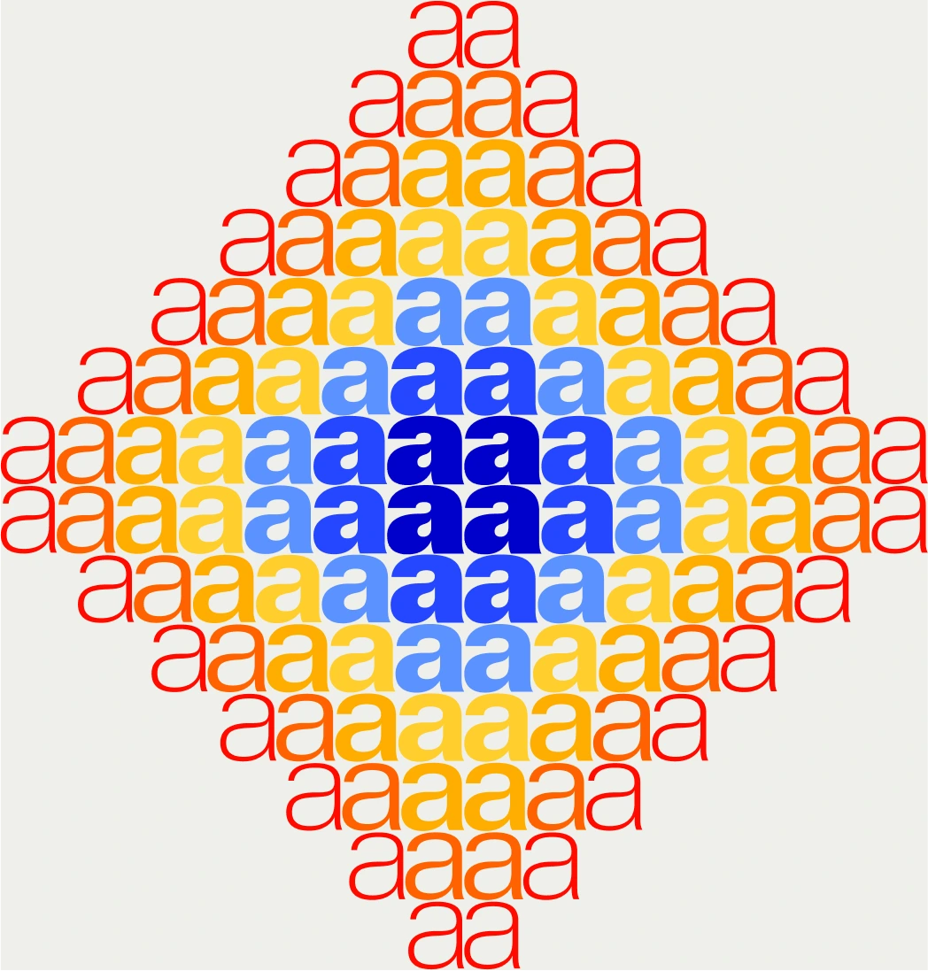
In 1962, Picelj initiated a series of his self-published “Edition a” art booklets, having released a total
of seven publications up until 1964. Each issue of “Edition a” featured the work of one artist —mostly of
a colleague whose work he admired. On top of that, Picelj designed, edited, and printed these all by himself.
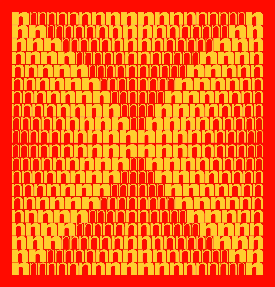
The visually most striking part of these 16×16 cm booklets was their covers, which featured the lowercase
letter “a”, silk-screened in a different, vibrant color for each of these issues. The letter itself appears
to be a modified version of Helvetica, a tremendously popular typeface during that period.
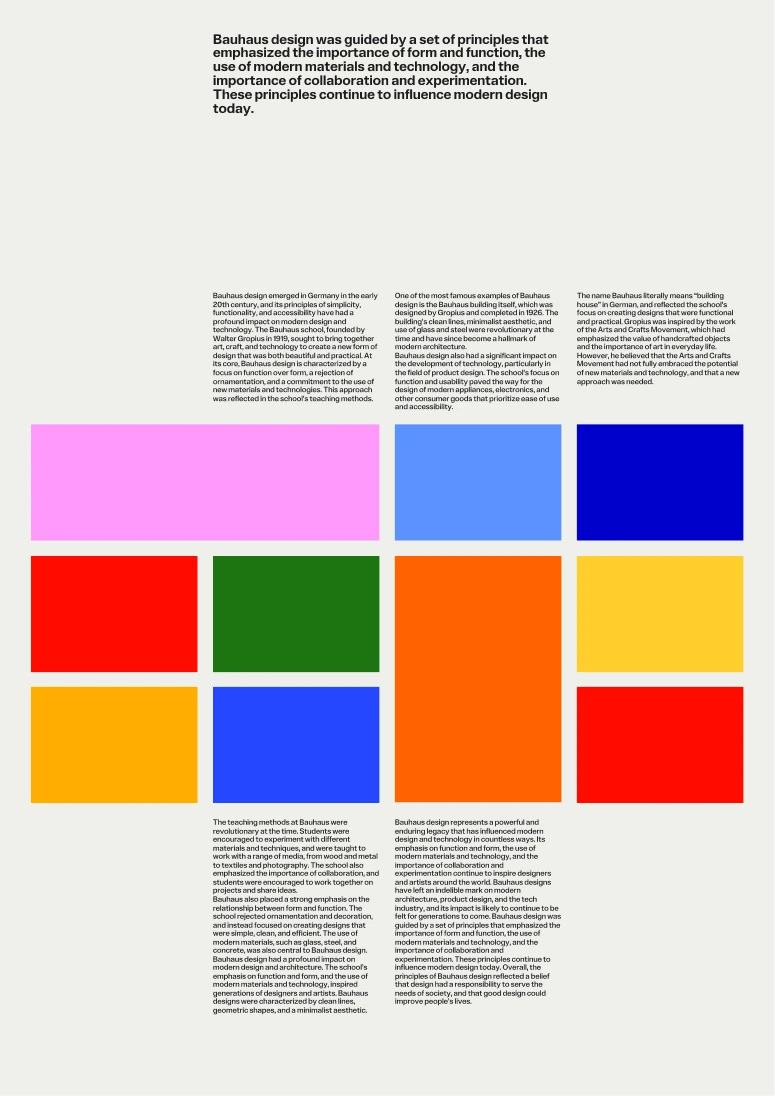
Concurrently, most European designers of that time sought clarity and visual unity, making modernism a powerful force in global graphic design, with its influence being palpable even today. Propelled by the work of Swiss masters—like Josef Müller-Brockmann, Armin Hofmann, and Emil Ruder—and the widespread use of the Helvetica typeface, modernism swiftly conquered the world, later even bearing the name International Style. The resulting designs were eclectic, vibrant, and infused with modernist energy. In large part thanks to Picelj, who “brought Helvetica to Croatia”, this style was cherished locally as well, putting Zagreb and Croatia on the International Style map.
Concurrently, most European designers of that time sought clarity and visual unity, making modernism a powerful force in global graphic design, with its influence being palpable even today. Propelled by the work of Swiss masters—like Josef Müller-Brockmann, Armin Hofmann, and Emil Ruder—and the widespread use of the Helvetica typeface, modernism swiftly conquered the world, later even bearing the name International Style. The resulting designs were eclectic, vibrant, and infused with modernist energy. In large part thanks to Picelj, who “brought Helvetica to Croatia”, this style was cherished locally as well, putting Zagreb and Croatia on the International Style map.

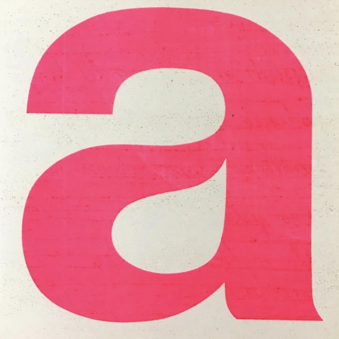
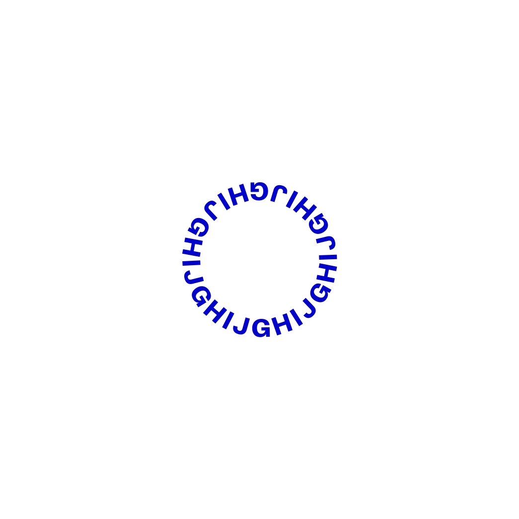
Exat started as a redrawing of a single letter “a” and the desire to craft a typographic world around it.

Hot Type constructed a typeface that would bear witness to the local story of homeland —
Croatia, but also be used by creatives all around the world, without necessarily having
to know how it came to be.
→
Exat strikes a balance between form and function, neutrality and character.
Type tester
28
28
28
28
28
28
28
28
28
28
modernism

becić
dabac
detoni
džamonja
horvat
knifer
meštrović
murtić
petlevski
picelj
richter
srnec
vaništa
dabac
detoni
džamonja
horvat
knifer
meštrović
murtić
petlevski
picelj
richter
srnec
vaništa

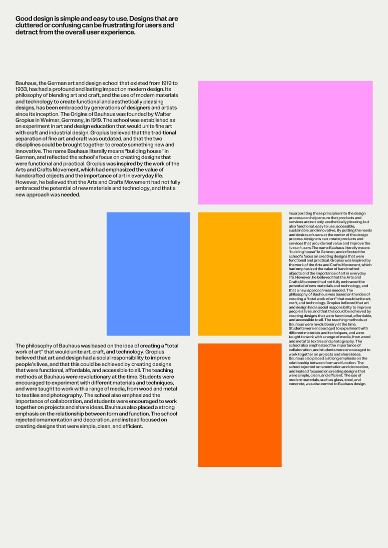
Modernism in Croatia emerged as part of broader European trends during the late
19th and early 20th centuries, reflecting the nation’s unique cultural and historical
context. The movement gained prominence in architecture, literature, painting, and design,
where Croatian artists sought to balance international modernist ideals with local traditions
and identities. Key influences included the Vienna Secession, Bauhaus, and other European
avant-garde movements, which inspired Croatian creatives to challenge classical forms and embrace innovation.
Croatian modernism developed as part of the broader European modernist movement, yet it retained a unique
identity shaped by the country’s cultural traditions and socio-political circumstances. It flourished in
the arts, architecture, and literature, leaving a lasting legacy on Croatian culture.
The modernist movement in Croatia during the early 20th century marked a period of
significant innovation across various artistic disciplines. Influenced by European
trends like the Vienna Secession, Cubism, and Bauhaus, Croatian modernists sought to
merge international styles with a strong sense of national identity.
This synthesis is particularly evident in architecture, where figures such as Drago
Ibler and Stjepan Planić created iconic works blending functionalism with local aesthetics.
Literature also flourished during this period, with Miroslav Krleža at the forefront, using
modernist techniques to critique social and political realities.
In the visual arts, Josip Račić and the Munich Circle introduced expressive and symbolic elements that later evolved into abstraction. The EXAT 51 group, established in 1950, became a pivotal force in advancing modernist ideals in post-war Croatia, promoting abstract art and connecting Croatian modernism to global movements. Despite political and cultural challenges, Croatian modernism achieved remarkable innovation, cementing its place as a key chapter in the country’s cultural history.
In the visual arts, Josip Račić and the Munich Circle introduced expressive and symbolic elements that later evolved into abstraction. The EXAT 51 group, established in 1950, became a pivotal force in advancing modernist ideals in post-war Croatia, promoting abstract art and connecting Croatian modernism to global movements. Despite political and cultural challenges, Croatian modernism achieved remarkable innovation, cementing its place as a key chapter in the country’s cultural history.

Glyphs for all occasions
Extensive Character Set
Exat consists of a whopping 1715 glyphs per style, ensuring adaptability across various
design contexts. The font includes many sets of numerals, symbols, standard and uppercase
punctuation, extensive currency symbol support, circled and squared letters and numbers,
math symbols, arrows—and even a dingbat set. All this makes Exat a powerful typographic
tool, aimed to aid in tackling your most demanding tasks.

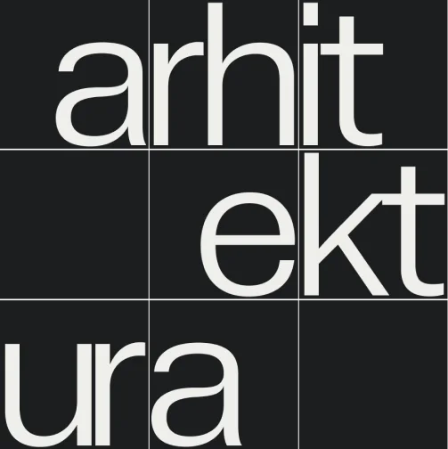
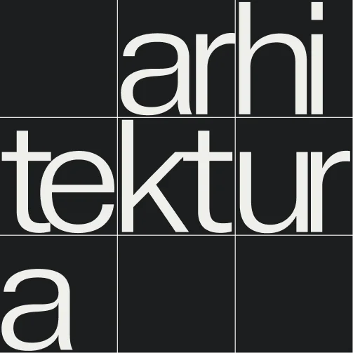


Exat has a range of glyphs, including some alternate symbols, making it flexible for all kinds of design projects.


Glyphset
a
a
a
a
a
a
a
a
a
a
a
a
a
a
a
a
a
a
a
a
a
a
a
a
a
a
a
a
a
a
a
a
a
a
a
a
a
a
a
a
a
a
a
a
a
a
a
a
a
a
a
a
a
a
a
a
a
a
a
a
a
a
a
a
a
a
a
a
a
a
a
a
a
a
a
a
a
a
a
a
a
a
a
a
a
a
a
a
a
a
a
a
a
a
a
a
a
a
a
a
a
a
a
a
a
a
a
a
a
a
a
a
a
a
a
a
a
a
a
a
a
a
a
a
a
a
a
a
a
a
a
a
a
a
a
a
a
a
a
a
a
a
a
a
a
a
a
a
a
a
a
a
a
a
a
a
a
a
a
a
a
a
a
a
a
a
a
a
a
a
a
a
a
a
a
a
a
a
a
a
a
a
a
a
a
a
a
a
a
a
a
a
a
a
a
a
a
a
a
a
a
a
a
a
a
a
a
a
a
a
a
a
a
a
a
a
a
a
a
a
a
a
a
a
a
a
a
a
a
a
a
a
a
a
a
a
a
a
a
a
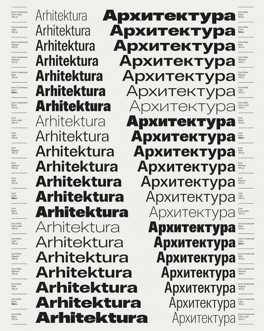
Widths, weights & variable font
Design Space
Exat comes in seven weights, ranging from Extra Light to Black. We expanded the system to the
Condensed, Normal, and Wide subfamilies to further enhance its versatility. This makes for a
total of 21 carefully crafted styles that retain a print-like quality on account of their
tight spacing and refined curves.
The variable font technology provides users with maximum control in choosing the exact type—fit for any setting.
The variable font technology provides users with maximum control in choosing the exact type—fit for any setting.
- Extra Light Condensed
- Light Condensed
- Regular Condensed
- Medium Condensed
- Bold Condensed
- Extra Bold Condensed
- Black Condensed
- Extra Light
- Light
- Regular
- Medium
- Bold
- Extra Bold
- Black
- Extra Light Wide
- Light Wide
- Regular Wide
- Medium Wide
- Bold Wide
- Extra Bold Wide
- Black Wide
Rẽ
Condensed
Fonts frame form,
clarity, and balance.
clarity, and balance.
Fonts frame form,
clarity, and balance.
clarity, and balance.
Fonts frame form,
clarity, and balance.
clarity, and balance.
Fonts frame form,
clarity, and balance.
clarity, and balance.
Fonts frame form,
clarity, and balance.
clarity, and balance.
Fonts frame form,
clarity, and balance.
clarity, and balance.
Fonts frame form,
clarity, and balance.
clarity, and balance.
Standard
Fonts frame form,
clarity, and balance.
clarity, and balance.
Fonts frame form,
clarity, and balance.
clarity, and balance.
Fonts frame form,
clarity, and balance.
clarity, and balance.
Fonts frame form,
clarity, and balance.
clarity, and balance.
Fonts frame form,
clarity, and balance.
clarity, and balance.
Fonts frame form,
clarity, and balance.
clarity, and balance.
Fonts frame form,
clarity, and balance.
clarity, and balance.
Wide
Fonts frame form,
clarity, and balance.
clarity, and balance.
Fonts frame form,
clarity, and balance.
clarity, and balance.
Fonts frame form,
clarity, and balance.
clarity, and balance.
Fonts frame form,
clarity, and balance.
clarity, and balance.
Fonts frame form,
clarity, and balance.
clarity, and balance.
Fonts frame form,
clarity, and balance.
clarity, and balance.
Fonts frame form,
clarity, and balance.
clarity, and balance.
In modernist graphic design, artists often sought to depict motion by using dynamic compositions,
lines, and abstract forms that conveyed energy and movement. Inspired by advancements in technology
and the fast-paced rhythm of modern life, many modernists aimed to capture the speed and dynamism of
the era. This is evident in works from movements like Futurism, where diagonal lines, repetitive patterns,
and overlapping shapes were employed to evoke a sense of motion and acceleration. The idea of motion
was further explored in Bauhaus graphic design, which used geometric forms and asymmetry to create visual tension and flow.

This approach can be closely linked to contemporary motion design,
where the principles of rhythm, flow, and dynamism are translated into animated graphics.
Just as modernist designs aimed to imply movement in static media, motion design takes these
ideas a step further by bringing them to life through animation, transforming visual elements
into dynamic experiences. While modernist artists relied on lines, shapes, and composition to
create the illusion of motion on a flat, static surface, motion design builds upon these
principles by incorporating time as a key dimension. This allows designers to manipulate how
elements move, interact, and evolve over time, adding layers of meaning and engagement that
static visuals cannot achieve.
Customisation with alternates
Stylistic sets
Inspired by the modernist era and local Croatian graphic design quirks—such as modified thin
accents—we developed a stylistic set that can turn diacritics, punctuation, and even symbols
into their thinner alternates.
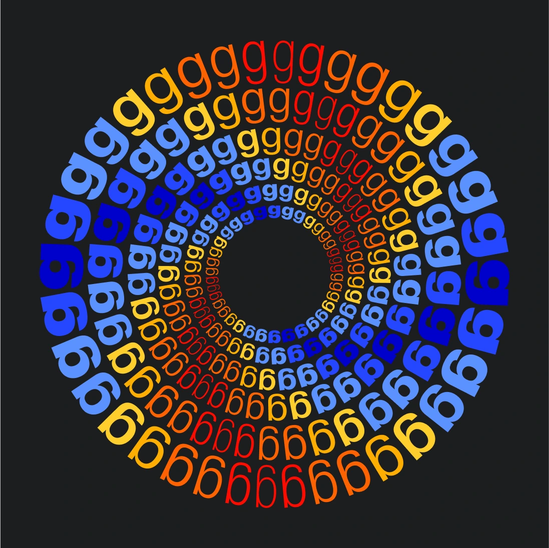
There is a substitute shape for the lowercase letter “a”, as well as options to place letters and numbers into squares and circles.
There is a substitute shape for the lowercase letter “a”, as well as options to place letters and numbers into squares and circles.
Thin Alternates
With this unique stylistic set you're able to transform
all accents and symbols into thin alternatives.


Encapsulated Numbers
Whether you're designing a wayfinding project or making a
magazine pagination, numbers inside circles and squares can often come in handy.


Encapsulated Letters
For a stronger visual impact, automatically place every letter
into a square or a circle. There are options with both full or empty shapes.


Alternative a
When the job gets really specific, opt for a version of lowercase letter a with a tail.
Smart functionality
Open Type Features
Everything you’d need when it comes to all-encompassing functionality—and then
Exat can do some more: case-sensitive characteristics, language-specific features,
stylistic interventions, and number-related properties, such as a slashed zero,
fractions, and superior/inferior figures.
Find out what Exat can do for you—it’s just a click away in the Open Type menu.
Find out what Exat can do for you—it’s just a click away in the Open Type menu.
- Case sensitive forms
- Fractions
- Numerators
- Denominators
- Superscript
- Subscript
- Tabular figures
- Slashed zero
- Catalan
- Dutch
- Romanian & Moldavian
- Serbian
- Bulgarian
- Ukraininan
Do bạch kim rất quý nên sẽ dùng để lắp vô xương.
Language: Vietnameese
Ó, náhlý déšť již zvířil prach a čilá laň teď běží s houfcem gazel k úkrytům.
Language: Czech
Høj bly gom vandt fræk sexquiz på wc.
Language: Danish
В чащах юга жил бы цитрус? Да, но фальшивый экземпляр!
Language: Russian
Jó foxim és don Quijote húszwattos lámpánál ülve egy pár bűvös cipőt készít.
Language: Hungarian
Victor jagt zwölf Boxkämpfer quer über den großen Sylter Deich.
Language: German
Do bạch kim rất quý nên sẽ dùng để lắp vô xương.
Language: Vietnameese
Two scripts, over 430 languages
Language Support
The character set supports over 430 languages. It covers Christoph Koeberlin’s Latin M
character set, standard for Latin-based languages.
When it comes to the Cyrillic script, Exat supports the Adobe Extended Cyrillic Glyph set for Russian, Belarussian, Bulgarian, Ukrainian, Serbian, and Macedonian.
character set, standard for Latin-based languages.
When it comes to the Cyrillic script, Exat supports the Adobe Extended Cyrillic Glyph set for Russian, Belarussian, Bulgarian, Ukrainian, Serbian, and Macedonian.